3.5 Making scientific figures
Making plots can be a great way to develop an intuition for your dataset, though to derive and communicate scientific insights, we need to have an idea of the uncertainty in our interpretations.
Uncertainty describes ideas such as: are the values between two groups different enough, that it is unlikely that the differences are due to chance? Is the correlation between these variables strong enough that one can predict the other, with some level of confidence? How statistically significant are the patterns we see?
3.5.1 Plotting error bars
When we compare measurements taken from two samples (i.e. two groups), we might want to see if the two groups have very different values for that specific measurement. If we have multiple observations within each group, we can take a summary statistic such as the mean or median and plot those against each other.

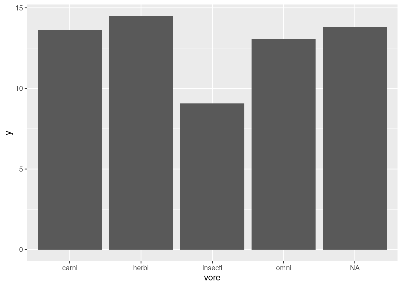
For example, here we have asked our geom_bar function to plot a summary, specifically the mean of each group, instead of plotting identity which usually means the value as is. Looking at this figure, we can’t guess if the groups are significantly different without an idea of the uncertainty in our measurements through something like error bars.
Here is the convention for plotting error bars in ggplot2, as you can see it is just another kind of geom that we can add to our plot:
ggplot(data = <SUMMARY DATA>, mapping = aes(<SUMMARY MAPPINGS>) + geom_bar(stat = "identity") + geom_errorbar(aes(<ERROR MAPPINGS>))
This method is straightforward, but you need to have pre-calculated the summary statistic for each group and the amount of error (i.e. standard error) from your data. That “aggregated” dataframe becomes the data that you provide to ggplot, instead of the original dataset (worksheet task 3.5.1A).
## `summarise()` ungrouping output (override with `.groups` argument)## # A tibble: 5 x 4
## vore y ymin ymax
## <chr> <dbl> <dbl> <dbl>
## 1 carni 13.6 12.6 14.7
## 2 herbi 14.5 13.6 15.4
## 3 insecti 9.06 6.41 11.7
## 4 omni 13.1 12.4 13.7
## 5 <NA> 13.8 12.7 14.9What does mean_se do? We can check.
This function returns three values, y, ymin, and ymax which correspond to the mean, the mean minus one standard error, and the mean plus one standard error. The mean value will be the height of each bar on the barplot, while ymin corresponds to the bottom of the error bar and ymax to the top of the error bar.
Let’s first plot the height of the bars using this new feeding.data dataset and mapping y to our new y column generated from the mean_se function. Here we create the same plot as before from this aggregated dataset, just showing the mean value in each group (worksheet task 3.5.1B).
Now we add the error bars, mapping the ymin and ymax values to the arguments that happen to have the same name in the geom_errorbar function. We add in the width setting just for aesthetics (worksheet tasks 3.5.1C and 3.5.1D).
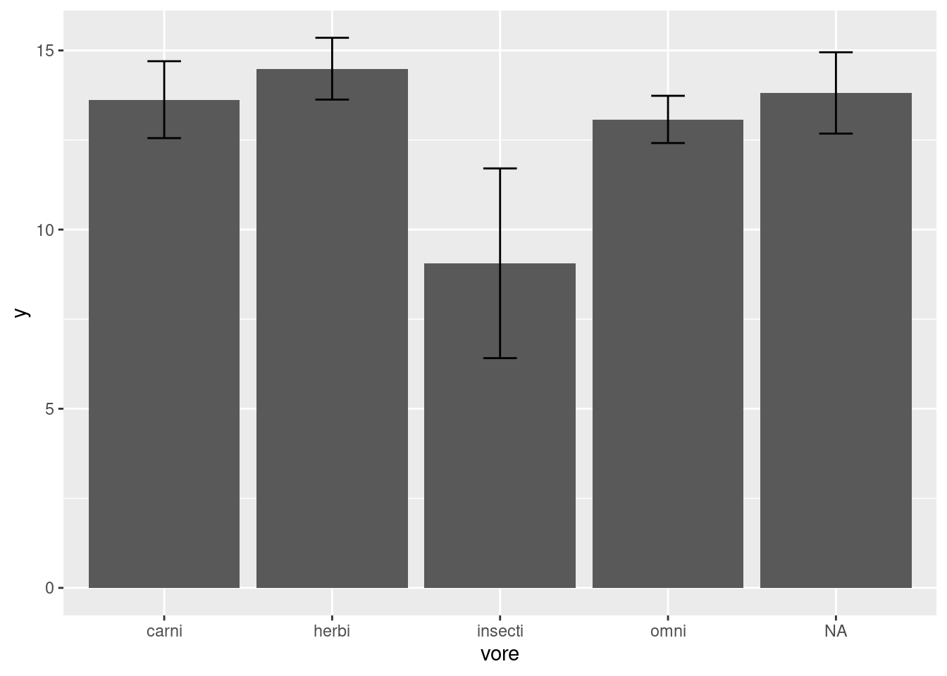
Now it is more clear that insectivores have significantly less time awake compared to other kinds of mammals.
3.5.2 Showing trends in data
Lots of these different figures summarize or aggregate the data. We may want to display the data with the individual points, but still show the overall trend across the data. Some good plots that do this are geom_density_2d which provides a contour plot.
Let’s check out the trend in our msleep data between body weight and brain weight. We will create a new column where we take the log value of body weight, like we did with brain weight.
msleep3 <- msleep2 %>% mutate(bodywt_log = log(bodywt))
ggplot(data = msleep3, mapping = aes(x = brainwt_log, y = bodywt_log)) +
  geom_density_2d() +
  geom_point()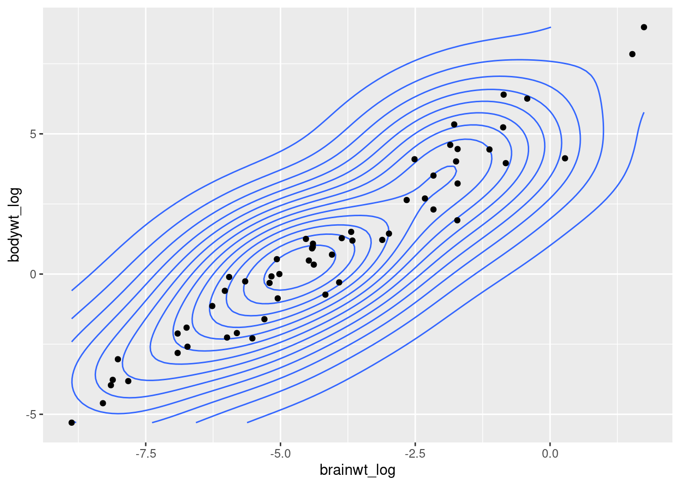
As you can see the density of points almost look like they fit a line. As brain weight increases then body weight increases, or vice versa. We can add a trendline to this plot with the geom_smooth function (worksheet tasks 3.5.2A and 3.5.2B).
## `geom_smooth()` using method = 'loess' and formula 'y ~ x'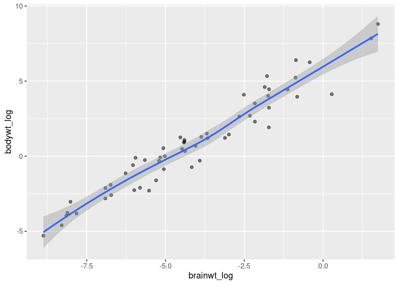
We can also do this with trendlines that summarize only certain subsets of the data, such as those that belong to a specific category. We will flip back to our iris dataset to look at how sepal length compares to sepal width between different species of iris.
ggplot(data = iris, mapping = aes(x = Sepal.Length, y = Sepal.Width)) +
  geom_point() +
  geom_smooth(aes(color = Species))
## `geom_smooth()` using method = 'loess' and formula 'y ~ x'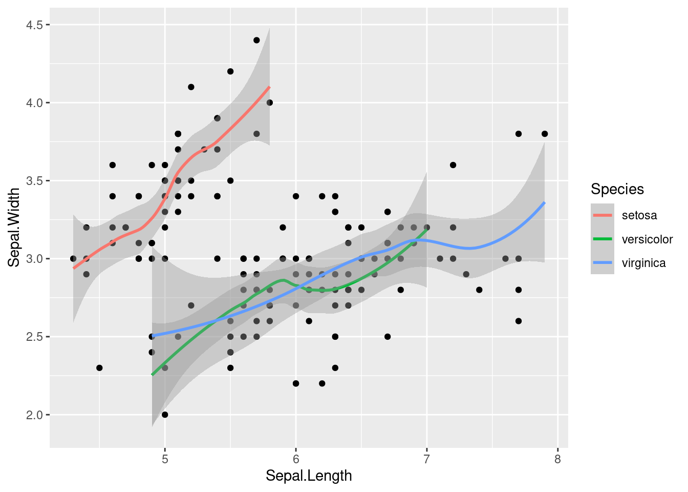
We create a seaprate trendline for each by specifiying the aes with color mapping to Species within the geom_smooth function.
The above plot may make it hard to see the data that is contributing to each trend line. Using facet_wrap again, we can split the figure into separate panel where the data has been filtered by the category (i.e. species) (worksheet task 3.5.2C).
ggplot(data = iris, mapping = aes(x = Sepal.Length, y = Sepal.Width)) +
  geom_point() +
  geom_smooth(aes(color = Species)) +
  facet_wrap( ~ Species)
## `geom_smooth()` using method = 'loess' and formula 'y ~ x'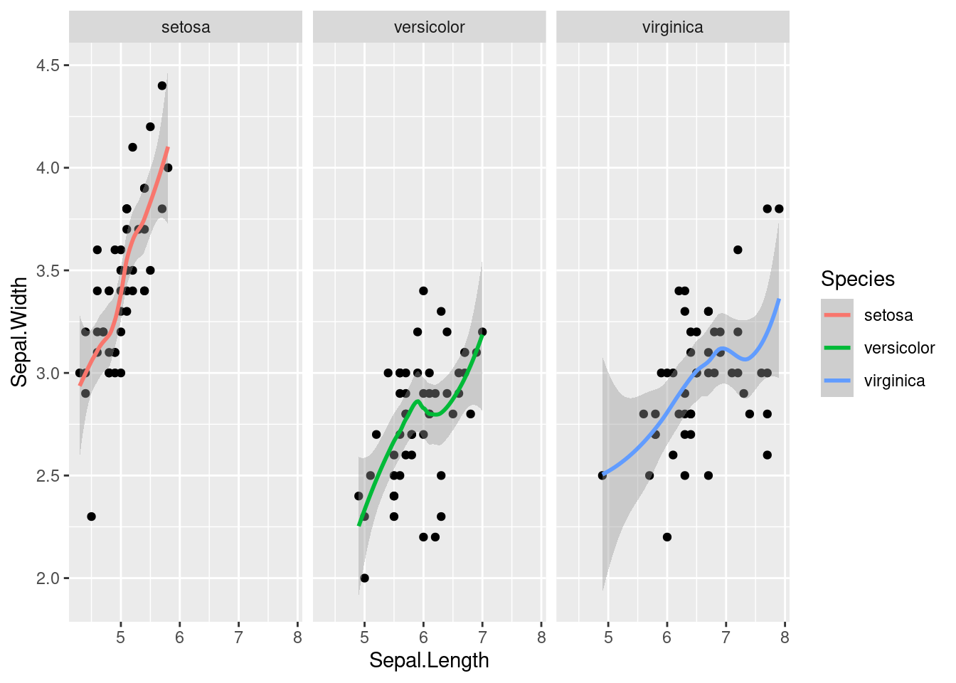
Now it is clear that there is a positive correlation (as one goes up, the other goes up) in each species of iris, but some species have a sharper upward trend than others.
3.5.3 Saving figures locally
As you produce analysis in your research, you may want to create high-quality images of your figures to then use in presentations or publications. There are two easy ways to save images as an individual file on your computer (worksheet tasks 3.5.3A and 3.5.3B),
The first method uses ggsave to save the most recent ggplot figure you generated (worksheet task 3.5.3C).
ggplot(msleep2, aes(x = brainwt_log, y = sleep_rem)) + geom_point() +
  geom_smooth(method = "lm")
ggsave("plot.png", width = 5, height = 5)
This function will save the figure just produced by this code wherever your directory is currently. You can check your current directory with getwd() and change with setwd(<FOLDER NAME>). You can also provide a precise file path in the new file name.
Here is an alternative method for saving your figures:
pdf("plot.pdf") # creates the file
# png() also works if you want a different file format
ggplot(msleep2, aes(x = brainwt_log, y = sleep_rem)) + geom_point() +
  geom_smooth(method = "lm")
dev.off() # finishes editing the file
Any changes to the figure that are contained between the initial creation of the figure (i.e. the pdf command) and the dev.off command will be included in the final saved image (worksheet task 3.5.3D). However, the figure is being printed directly to the file it is writing and won’t appear elsewhere (worksheet task 3.5.3E).
Licensed Creative Commons Attribution-NonCommercial-ShareAlike 4.0